May 22, 2015

April 24, 2015
Global Risks
Picture this: Every January. Davos. World Economic Forum.
Most people would envision an exclusive gathering of the
world’s movers and shakers, some might see a big collection of private jets,
but since I’m a data analyst the only thing I can think of is… lots of
data. And I’m not disappointed.
Since 2006, the World Economic Forum has published the annual
Global Risks report which identifies risks that might cause significant
negative impact for several countries and industries. A key characteristic of global risks is their
potential systemic nature to affect an entire system, as opposed to individual
parts and components.
The risks can be viewed in terms of the financial impact
they might cause or the probable likelihood they might occur. The risks are also grouped into five
categories: (1) Economic, (2) Environmental,
(3) Geopolitical, (4) Societal, & (5) Technological.
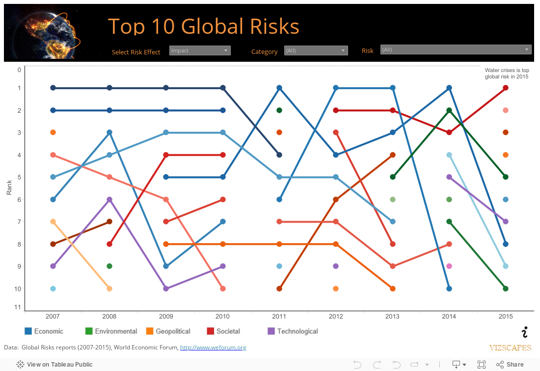
The data was visualized as a bump chart. The viz reveals that economic risk dominated
from 2007 to 2014, such as asset-price bubble as top risk (during the Global Financial
Crisis 2007-2009) and fiscal crises as a result of constrained fiscal finances (immediate
post-crisis years 2010-2014).
In 2015, societal and geopolitical risks emerge as top risks
with water crises (prolonged drought), spread of infectious diseases (Ebola in
West Africa), and interstate conflict (rise of Islamic State) occupying the top
five risks. Also in 2015, water crises
becomes the number 1 global risk in terms of impact and its category is
changed from environmental to societal to reflect its potential enormous effect
to social stability.
April 3, 2015
Eigentaste's Funniest Jokes
Eigentaste is a collaborative filtering algorithm to elicit real-valued user ratings on a common set of items and applies principal component analysis (PCA) to the resulting dense subset of the ratings matrix (Technical talk).
Eigentaste is a technology to deliver personalized jokes
catered to your own taste, imagine that! (Marketing talk).
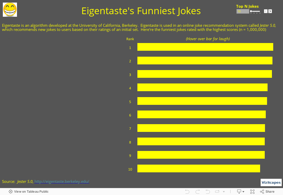
Eigentaste was developed by Professor Ken Goldberg and his team at the University of California, Berkeley. The technology has been implemented in Jester 5.0, an online joke system, to recommend new jokes to users based on their ratings of the initial set. Here’re the funniest jokes from Jester 5.0 based on users’ highest rating.
Laugh more, live longer!
March 6, 2015
Doing Business 2015
Doing Business 2015 – Going Beyond Efficiency is a flagship report from the World Bank Group based in Washington DC. This global thematic report measures business regulations whether they enhance or constrain business activity in 189 economies around the world (download report here). Government with an efficient bureaucracy plays a critical role in providing a right environment where individuals and businesses will thrive. Too much regulation is a recipe for economic stagnation whereas too little regulation can lead to economic disaster (remember the Great Recession?).
In
this report , the countries are ranked by the Ease of Doing Business
score, which is a composite of the
following 10 indicators: 1)
Starting a business, 2) Dealing with construction permits, 3) Getting electricity, 4) Registering property, 5) Trading across borders, 6)
Getting credit, 7) Protecting minority investors, 8) Enforcing contracts, 9) Resolving insolvency, & 10) Labor market regulation.
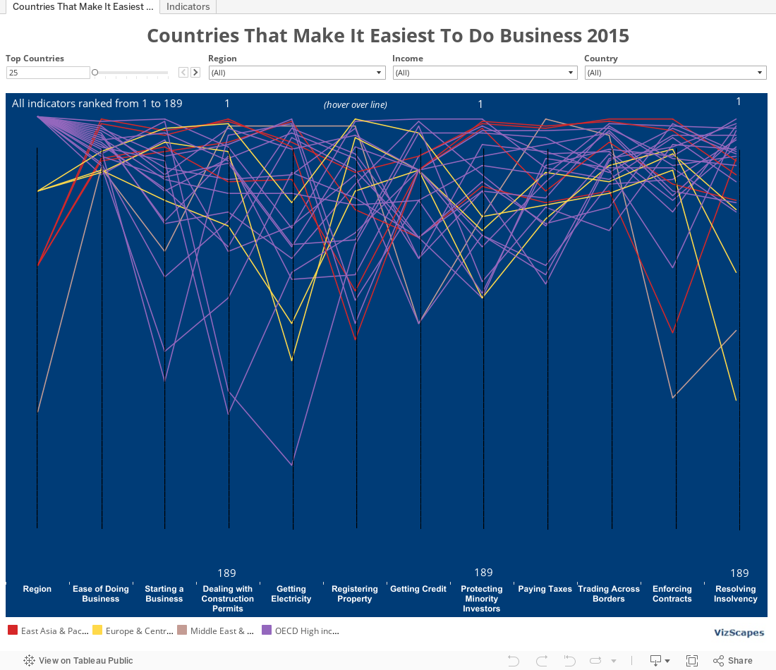
Parallel
coordinates were used to visualize this multi-dimensional data. The best way to utilize this visualization is
to filter the data by region, income, or country. Otherwise if all 189 countries were displayed,
the chart would become a colorful abstract visualization with too much
information!
The
top 3 economies that make it easiest to do business in 2015 are Singapore, New
Zealand, and Hong Kong, ranked 1, 2, and 3, respectively. Now go ahead and compare countries of your
choice to see which nation is more business-friendly so that you can open your
oversea office or start your business there!
February 13, 2015
GE Data Visualization
I’ve recently got a new job at GE Global Research in San
Ramon, CA.
GE is a global corporation that brings together the
brightest engineers and scientists to solve complex scientific problems. GE technologies generate huge data
(petabytes) that contains valuable information which can drive insights,
innovations, and discoveries. GE is
using data visualization to pair science and design in order to bring forward
the meaning behind the data.
Check out some cool vizs at GE Data Visualization.

January 23, 2015
Discrimination in Online Ad Delivery
Have you been arrested? Imagine this question appears when someone searches for your name on the Internet. The Discrimination in Online Ad Delivery report by Professor Latanya Sweeney from Harvard University indicated that an Internet search by black-identifying names was more likely to yield an advertisement suggestive of an arrest record than a search by white-identifying names (download report here). This racially biased advertisement distribution could inadvertently impact a person’s reputation and the affected person might not know about the potential negative consequences.
However, advertisers are protected under the First Amendment of the Constitution that advertisements are commercial free speech. But what if the advertisements suggestive of a criminal background appear more frequently for one racial group than for another’s, is that still free speech or has it become racial discrimination? As this research yielded more questions than answers, perhaps Internet search companies should yield to moral high grounds and refine their search logic to provide a user experience free of racial bias.
This viz was influenced by the New York Times’ “Why Is Her Paycheck Smaller” graph, which has been well-received in the data visualization community for its elegant use of annotation to deliver the thought-provoking message. In order to draw the diagonal lines in the scatter plot, I sought help from Tableau Zen Master extraordinaire, Joe Mako. Then I inserted the ‘% Arrest Ads’ annotations to the viz. The final result highlights the unfair issue of discrimination in online ad delivery.
In addition, the box plots to the right show the differential on the arrest ads display when searching for names according to race and gender.
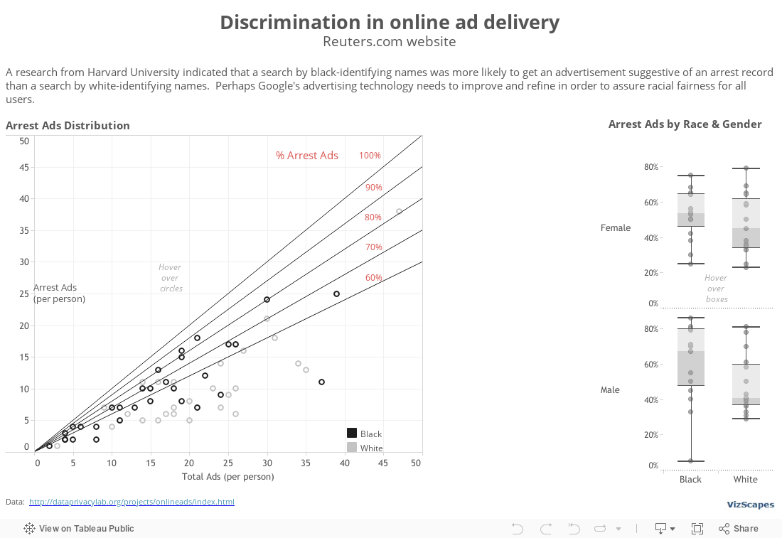
This viz was made possible with the permission of Professor Latanya Sweeney from Harvard University and the contribution of Joe Mako, Tableau Zen Master. I'm grateful to both for their generosity.
January 2, 2015
Global Warming
Let’s start the New Year with a hot topic and a Nobel-Prize-quality global thematic
report. The ‘Climate Change 2013 Assessment Report’, produced by the Intergovernmental Panel on Climate Change (IPCC) based in Geneva, provides a comprehensive view of
the current scientific knowledge of climate change. It’s a compelling read into global warming and
its potential environmental and socio-economic impacts.
What fascinating about this authoritative 1522-pages report is that it contains 482 sophisticated graphs that help to illustrate complex concepts into something more understandable. The graphs play an important role in consolidating numerous points into singular visualizations that define a central concept. If a picture is worth a thousand words, then these 482 graphs tell many mini-stories and together enhance the value of the report tremendously.


I’m happy to recommend this extraordinary report because (1) global warming is currently relevant, and (2) this report is a fine example of how the combination of excellent research writing and meaningful data visualization/illustration can yield outstanding result. This report is epic. Obviously, there’ll be no viz of mine because none is needed. By the way, Al Gore and IPCC shared the 2007 Nobel Peace Prize together.
Subscribe to:
Posts (Atom)