December 28, 2022

Sort Measures with RANK Function


This post will describe how to sort the measures by using the RANK() function. The sort will be descending with the largest values appearing on top. Here're the steps:


Step1:  Create a formula for each of the measures to be sorted so that if the measure is null, it'll be assigned a big negative number so that it'll appear at the bottom.


@Profit (rank)

//if value is null, make it negative so it will rank at bottom

if isnull(sum([Profit])) then -9999 else sum([Profit]) end


Step 2: Create a 'Sort By' parameter with a list of measures.


Step 3: Create a formula using the RANK() function to sort the measures. For example,


@Rank

CASE [Sort By]

When 'Quantity' then RANK([Quantity (rank)])

When 'Profit' then RANK([Profit (rank)])

When 'Sales' then RANK([Sales (rank)])

When 'Profit Ratio' then RANK([Profit Ratio (rank)])

END


Step 4: Place this @Rank formula in front of the dimension in the Rows shelf.


Step 5: Display the 'Sort By' parameter for users to sort.


October 14, 2022

Cannot Mix Aggregate and Non-Aggregate Comparisons

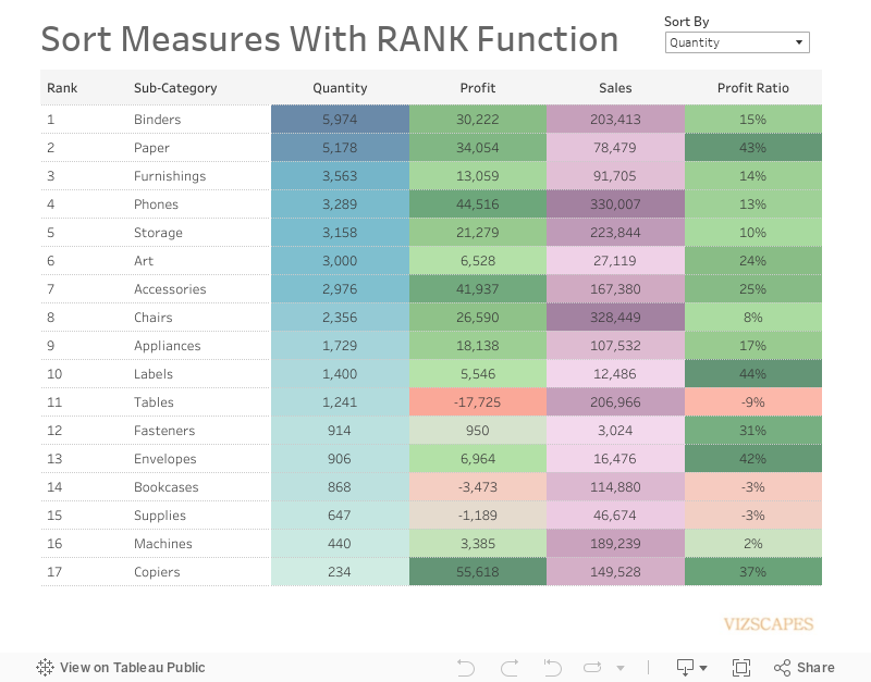
When creating formula in Tableau, one might encounter one of these errors,


'Cannot mix aggregate and non-aggregate arguments with this function' or
'Cannot mix aggregate and non-aggregate comparisons or results in 'if' expression'

The reason is one cannot mix an aggregate argument such as AVG(), SUM(), COUNT() with a non-aggregate dimension.


Tableau has published a KB article that provides resolutions for this error. The article has different resolutions for different calculation scenarios.

Let's go through an example to demonstrate how to resolve this error based on the sample data set and business requirement.

The sample data set has 2 dimensions 'Table', 'Access', and 1 measure 'Sigma'.

Step 1: Average the sigma values for each table, which results in an aggregate value.

@Avg Sigma
AVG([Sigma])

Step 2: Calculate if absolute value of @Avg Sigma < 1 then True else False.

@Avg Sigma Boolean
if ABS([Avg Sigma]) < 1 then True else False end

Step 3: Compare if Avg Sigma Boolean = True or Access = True then assign 'Pass' else 'Fail'. Note that this formula mixed an aggregate and non-aggregate comparisons.

@Pass/Fail
if {FIXED [Table]:[Avg Sigma Boolean]} or [Access] = True then 'Pass' else 'Fail' end

Here level of detail calculation is used to bring Avg Sigma Boolean to a row level calculation and to de-aggregate Avg Sigma Boolean. This method is listed under option 4 in the KB article.

Step 4: Count how many tables are assigned 'Pass', which is the final result.

@Pass Tables
COUNTD(if [Pass/Fail]='Pass' then [Table] end)


One might be tempted to make this 'Pass/Fail' formula work by wrapping [Access] with ATTR function in order to make both arguments aggregate.

@Pass/Fail (kaputt)
if [Avg Sigma Boolean] or ATTR([Access]) then 'Pass' else 'Fail' end

However, when you count how many tables are assigned 'Pass' by making another aggregation, you'll encounter the error 'Cannot mix aggregate and non-aggregate comparisons or results in 'if' expression '.

@Pass Tables (won't work)
COUNTD(if [Pass/Fail (kaputt)]='Pass' then [Table] end)


September 16, 2022

10-Year Government Bond Yield


If you have a dense time-series data without seasonality, one of the most effective visualization techniques is the horizon chart.  This advanced chart does require some complex calculations to create.  Thankfully, Marc Reid has written a blog post on what the horizon chart is about and how to create it. 
 
Marc also has published a video to show how to copy over the calculations and worksheets to your own workbook to create your horizon chart.  I followed the steps in his video and created the above horizon chart rather easily.
 
Note that Marc Reid’s post referred to Yvan Fornes’s blog post in which Yvan wrote about setting the stack marks option to Analysis > Stack Marks > On.  I think this is a misstatement as you want to set the stack marks to ‘Off’ (not ‘On’).
 
Tableau describes stack marks as ‘When marks are stacked, they are drawn cumulatively along an axis.  When marks are not stacked, they are drawn independently along an axis. That is, they are overlapping.’  That’s what you want in the horizon chart where the marks in area chart should overlap.  So set the stack marks to ‘Off’.
 
Now let's compare between cycle plot (for time-series data with seasonality) and horizon plot (for dense time-series data without seasonality) to see why different types of data require different types of visualization.
 
If we were to visualize the bond yield data for 18 countries (which is a dense time-series data without seasonality) as a cycle plot, we would get something like this.   


This graph is considered not useful because it would take too much time for the users to determine useful trends.  So the job of a data visualization designer is to know and apply the appropriate type of visualization for the specific type of data.


August 26, 2022

US Retail Sales


Tableau Zen Master Andy Kriebel recently published an article about cycle plot.  Cycle plot is an effective visualization technique to show trend for time-series data with seasonality.  This visualization is surprisingly not well-known so I’m publishing it here to propagate it.
 

The cycle plot is using the US monthly retail sales data from 1992 to 2022.  The visualization for the US department stores sales clearly shows three trends: (1) the seasonality of sales where November and December have highest sales, (2) the steep drop in sales in 2020 at the start of the COVID pandemic, and (3) the overall downward trend starting in 2000.  The sales decrease was perhaps caused by the rise in e-commerce at the start of the century as well as the movement toward casual wear where people don’t need to spend that much for office wear.


April 15, 2022

How to Connect Tableau Desktop to Sharepoint Lists


Here’re the steps on how to connect Tableau Desktop to SharePoint Lists:


1)  Download SharePoint Lists driver so that Tableau Desktop can connect to SharePoint.

https://www.tableau.com/support/drivers?_ga=2.72715419.922138399.1560965713-928115632.1560965713


2)  Open Tableau Desktop, go to Data \ New Data Source

In the Connect screen, select SharePoint Lists.


3)  In the SharePoint Lists log in screen, enter


SharePoint Site:  the base URL of SharePoint Site (e.g. https://companyabc.sharepoint.com/sites/DataAnalytics)

Edition:  SharePoint Online

Authentication:  Third-party SSO

        Username:  enter your full email address (including @companyabc.com)

        Password:  enter your password

        SSO Domain:  companyabc.com


Then, click Sign In button.


4)  After Tableau establishes connection to SharePoint, a list of tables will appear on the left side.


5)  Select the appropriate table, then double-click or drag the table to the canvas.