
December 2, 2016
October 14, 2016
How To Use Filter To Remove Nulls From Calculated Field
This short & neat post describes an interesting solution on how to use filter to remove null values from a calculated field.
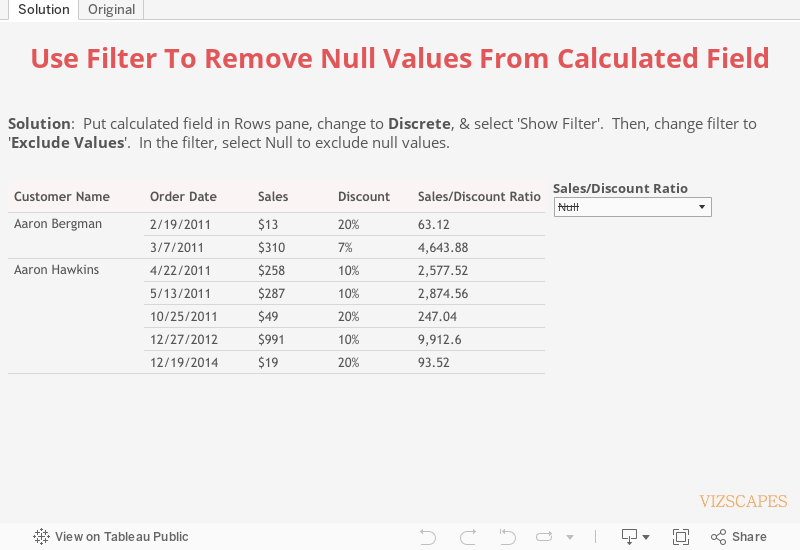
Scenario: Users would like to have an option to filter null values from a calculated field.
Error: To filter null values, the calculated field is put in the Rows pane, converted to discrete, and selected ‘Show Filter’. However, if ‘Null’ is de-selected from the filter, an error message ‘invalid filter predicate’ will appear.

Fortunately, there’s a work-around solution for this bug (which is noticed in Tableau Desktop 9.2 and 10).
Solution: Put calculated field in Rows pane, change to Discrete, & select 'Show Filter'. Change filter to 'Exclude Values'. In the filter, select Null to exclude null values.
September 16, 2016
How To Color Band Conditionally
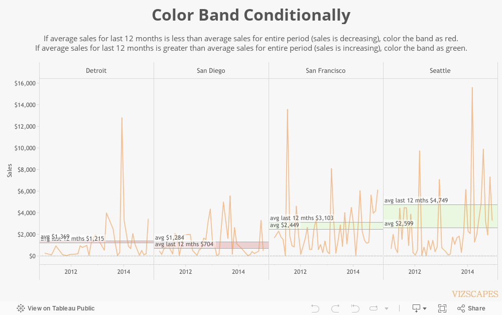
This post describes a fascinating procedure on how to create different color bands conditionally in a line chart with two reference lines.
Scenario: In a line chart, there're two reference lines, one for the entire period and another for the last twelve months. The requirement is to color the bands between the two reference lines by different colors based on:
a) If average sales for last 12 months is less than average sales for entire period (sales is decreasing), color the band as red.
b) If average sales for last 12 months is greater than average sales for entire period (sales is increasing), color the band as green.
Procedure: To calculate sales for last 12 months, create
this formula:
@Sales (last 12 months)
if attr(DATEDIFF('month', [Order Date] , {MAX([Order Date])}
)) < 12 then Sum([Sales]) END
Then put this formula in the Detail pane and create the second reference line.

But then how do you color the band conditionally based on the difference of two average sales?
First, create formulas for average sales and average sales last 12 months.
@avg
window_avg(sum([Sales]))
@avg last 12 mths
window_avg([Sales (last 12 mths)])
Next, create a formula to return True/False based on the condition how to change color of the band.
@color T/F
[avg] > [avg last 12 mths]
Then, create four separate formulas in order to build two sets of reference lines, one set for red and another set for green.
Red reference lines are used for decreasing sales (when average sales for last 12 months is less than average sales for entire period):
@avg last 12 mths (less)
IF [color T/F] then [avg last 12 mths] END
@avg (more)
IF [color T/F] then [avg] END
Green reference lines for increasing sales (when average sales for last 12 months is more than average sales for entire period):
@avg last 12 mths (more)
IF NOT [color T/F] then [avg last 12 mths] END
@avg (less)
IF NOT [color T/F] then [avg] END
Put these four formulas along with formula @color T/F in the Detail pane. Change the five formulas to compute Pane (across) in order to calculate per each city.
To color the band conditionally, right-click on Sales axis and select ‘Add Reference Line.’ To color the band as red when average sales for last 12 months is less than average sales for entire period, select ‘Band’ for reference band. Under ‘Band From’, choose ‘avg (more)’ for ‘Value’. Under ‘Band To’, choose ‘avg last 12 mths (less)’ for ‘Value’. Under ‘Formatting’, pick a red color for ‘Fill’.

To color the band as green when average sales for last 12 months is more than average sales for entire period, select ‘Band’ for reference band. Under ‘Band From’, choose ‘avg (less)’ for ‘Value’. Under ‘Band To’, choose ‘avg last 12 mths (more)’ for ‘Value. Under ‘Formatting’, pick a green color for ‘Fill’.

The benefit of conditional color band is that it highlights which cities have increasing or decreasing sales during last 12 months. And the impact is that users are visually notified what cities to pay attention to, especially if sales is decreasing.
August 19, 2016
Happy Planet Index
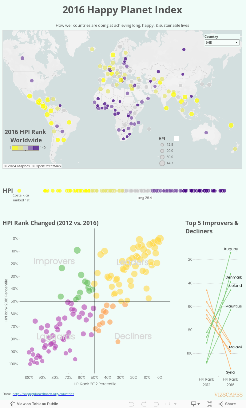
The 2016 Happy Planet Index (HPI), released by the New Economic Foundation in London, measures how well nations are doing at achieving long, happy, and sustainable lives. Using ecological footprint as one of its measures, HPI highlights that it's possible to achieve high life expectancy & wellbeing without consuming too much resources from the Earth.
As a result, countries with high GDP that consume too much energy and have high ecological footprint might rank lower than countries with lower GDP and smaller ecological footprint. For 2016, Costa Rica ranks first with the highest HPI. Then, Mexico, Colombia, Vanuatu, and Vietnam round out the top five.
The visualization shows the country rankings throughout the world according to 2016 HPI. Costa Rita ranks first, followed by Mexico, Columbia, Vanuatu, and Vietnam. The ‘HPI Rank Changed (2012 vs. 2016)‘ section is a quadrant analysis that compares the HPI country ranking changes between 2012 and 2016. Syria is the biggest decliner whereas Uruguay, biggest improver.
July 29, 2016
Restaurant Reviews
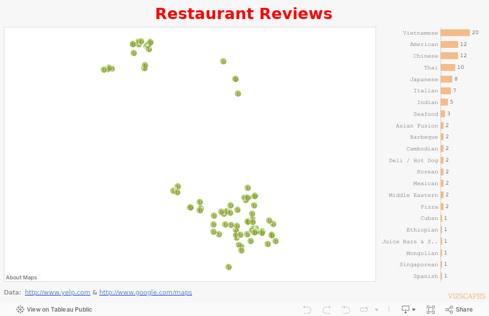
A foodie I am not, but I do have an appetite for international cuisines. Living in the San Francisco Bay Area that has a United Nations-like demographic allows me to savor some of the most delectable food around the world.
This viz maps the restaurants that I’ve frequented over the years. The background map is from Mapbox (thanks to the seamless integration of Mapbox in Tableau). Hovering over the green location icons will display restaurants’ information and my reviews. Bon appetite!
July 8, 2016
Encryption Products
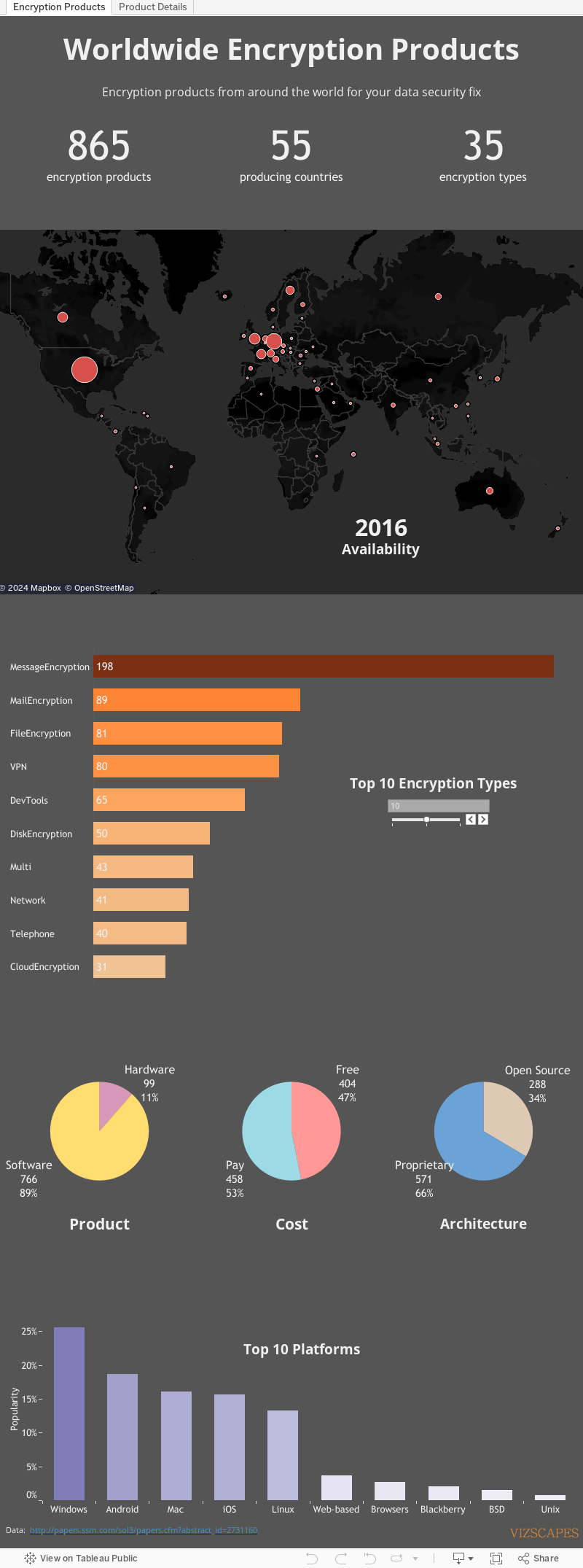
In February 2016, Professor Bruce Schneier and his team at the Berkman Center for Internet & Society at Harvard University released A Worldwide Survey of Encryption Products report that lists a whole array of encryption solutions available. These varied products, whether proprietary or open-source, for sale or free, software or hardware, are designed to combat the growing data security problem.
This visualization showcases that report data.
June 17, 2016

May 27, 2016
Homeless Veterans
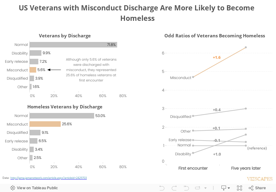
Idea for this visualization came from this article about the plight of US veterans with misconduct discharge. The article mentions about the research that shows US veterans returning from Afghanistan and Iraq with general misconduct discharge have highest risk of becoming homeless, comparing to other discharge categories.
This study is significant because it highlights the contradiction between the reality where the number of US soldiers discharged with misconduct is increasing and the federal government priority to end homelessness among veterans! Let’s hope the federal policy will be amended to match the reality so that the veterans can receive some help.
(Some of you might wonder if the veterans who were discharged with misconduct deserve to have benefits from the government as other veterans? Maybe or maybe not. But if the question were rephrased as “Do veterans who were deployed multiple times and served in combat but were discharged with misconduct deserve to have benefits from the government as other veterans?”, would that change your opinion?)
Subscribe to:
Posts (Atom)