This post describes a fascinating procedure on how to create different color bands conditionally in a line chart with two reference lines.
Scenario: In a line chart, there're two reference lines, one for the entire period and another for the last twelve months. The requirement is to color the bands between the two reference lines by different colors based on:
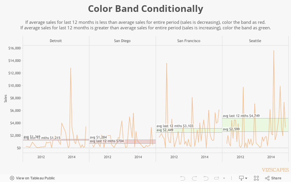
a) If average sales for last 12 months is less than average sales for entire period (sales is decreasing), color the band as red.
b) If average sales for last 12 months is greater than average sales for entire period (sales is increasing), color the band as green.
Procedure: To calculate sales for last 12 months, create
this formula:
@Sales (last 12 months)
if attr(DATEDIFF('month', [Order Date] , {MAX([Order Date])}
)) < 12 then Sum([Sales]) END
Then put this formula in the Detail pane and create the
second reference line.
But then how do you color the band conditionally based on the
difference of two average sales?
First, create formulas for average sales and average sales
last 12 months.
@avg
window_avg(sum([Sales]))
@avg last 12 mths
window_avg([Sales (last 12 mths)])
Next, create a formula to return True/False based on the
condition how to change color of the band.
@color T/F
[avg] > [avg last 12 mths]
Then, create four separate formulas in order to build two
sets of reference lines, one set for red and another set for green.
Red reference lines are used for decreasing sales (when
average sales for last 12 months is less than average sales for entire period):
@avg last 12 mths (less)
IF [color T/F] then [avg last 12 mths] END
@avg (more)
IF [color T/F] then [avg] END
Green reference lines for increasing sales (when average
sales for last 12 months is more than average sales for entire period):
@avg last 12 mths (more)
IF NOT [color T/F] then [avg last 12 mths] END
@avg (less)
IF NOT [color T/F] then [avg] END
Put these four formulas along with formula @color T/F in the Detail pane. Change the five formulas to compute Pane
(across) in order to calculate per each city.
To color the band conditionally, right-click on Sales axis
and select ‘Add Reference Line.’ To
color the band as red when average
sales for last 12 months is less than average sales for entire period, select ‘Band’
for reference band. Under ‘Band From’,
choose ‘avg (more)’ for ‘Value’. Under
‘Band To’, choose ‘avg last 12 mths (less)’ for ‘Value’. Under ‘Formatting’, pick a red color for
‘Fill’.
To color the band as green when average sales for last 12 months is more than average
sales for entire period, select ‘Band’ for reference band. Under ‘Band From’, choose ‘avg (less)’ for
‘Value’. Under ‘Band To’, choose ‘avg
last 12 mths (more)’ for ‘Value. Under ‘Formatting’,
pick a green color for ‘Fill’.
The benefit of conditional color band is
that it highlights which cities have increasing or decreasing sales during last
12 months. And the impact is that users
are visually notified what cities to pay attention to, especially if sales is
decreasing.