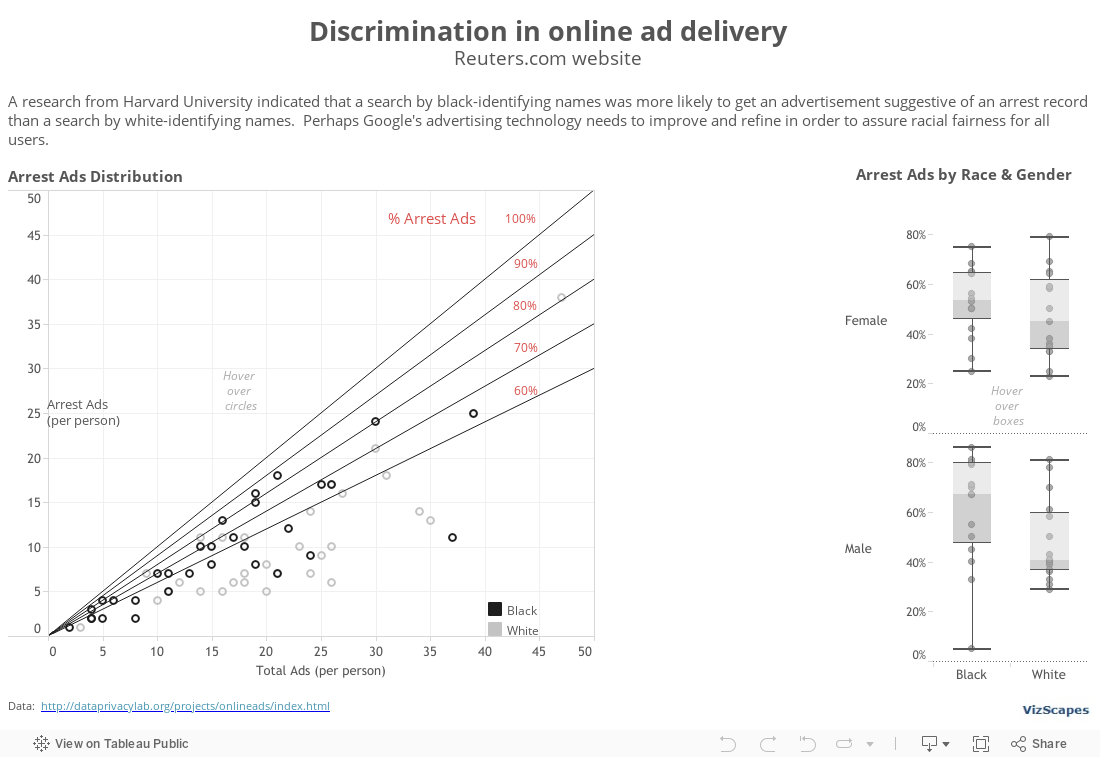
Have you been arrested? Imagine this question appears when someone
searches for your name on the Internet. The Discrimination in Online Ad Delivery report by Professor Latanya Sweeney from Harvard University indicated
that an Internet search by black-identifying names was more likely to yield an
advertisement suggestive of an arrest record than a search by white-identifying
names (download report here). This
racially biased advertisement distribution could inadvertently impact a
person’s reputation and the affected person might not know about the potential negative
consequences.
However,
advertisers are protected under the First Amendment of the Constitution that
advertisements are commercial free speech. But what if the advertisements suggestive of a
criminal background appear more frequently for one racial group than for another’s,
is that still free speech or has it become racial discrimination? As this research yielded more questions than
answers, perhaps Internet search companies should yield to moral high grounds
and refine their search logic to provide a user experience free of racial bias.
This viz was
influenced by the New York Times’ “Why Is Her Paycheck Smaller” graph, which has been well-received in the data
visualization community for its elegant use of annotation to deliver the
thought-provoking message. In order to
draw the diagonal lines in the scatter plot, I sought help from Tableau Zen
Master extraordinaire, Joe Mako. Then I
inserted the ‘% Arrest Ads’ annotations to the viz. The final result highlights the
unfair issue of discrimination in online ad delivery.
In addition,
the box plots to the right show the differential on the arrest ads display when
searching for names according to race and gender.
This viz was made possible with the permission of Professor Latanya Sweeney from Harvard University and the contribution of Joe Mako, Tableau Zen Master. I'm grateful to both for their generosity.
Let’s start the New Year with a hot topic and a Nobel-Prize-quality global thematic
report. The ‘Climate Change 2013 Assessment Report’, produced by the Intergovernmental Panel on Climate Change (IPCC) based in Geneva, provides a comprehensive view of
the current scientific knowledge of climate change. It’s a compelling read into global warming and
its potential environmental and socio-economic impacts.
What
fascinating about this authoritative 1522-pages report is that it contains 482 sophisticated
graphs that help to illustrate complex concepts into something more understandable. The graphs play an important role in
consolidating numerous points into singular visualizations that define a
central concept. If a picture is worth a
thousand words, then these 482 graphs tell many mini-stories and together enhance
the value of the report tremendously.
I’m happy to
recommend this extraordinary report because (1) global warming is currently
relevant, and (2) this report is a fine example of how the combination of excellent
research writing and meaningful data visualization/illustration can yield
outstanding result. This report is epic. Obviously, there’ll be no
viz of mine because none is needed. By
the way, Al Gore and IPCC shared the 2007 Nobel Peace Prize together.