Tableau Zen Master Andy
Kriebel recently published an article about cycle plot. Cycle plot is an effective visualization
technique to show trend for time-series data with seasonality. This visualization is surprisingly not
well-known so I’m publishing it here to propagate it.
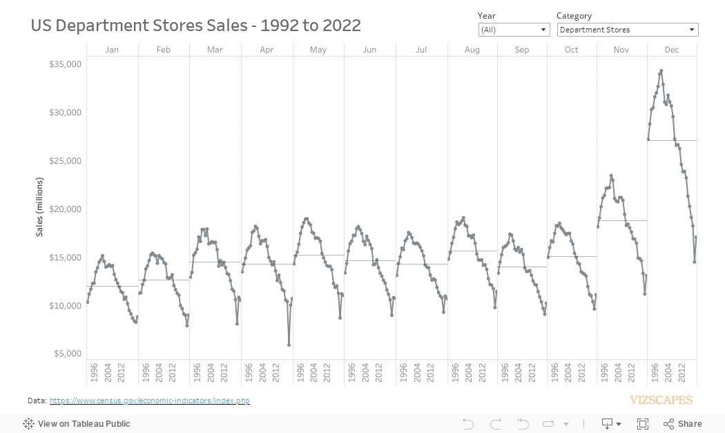
The cycle plot is using the US monthly retail sales data from 1992 to 2022. The visualization for the US department stores sales clearly shows three trends: (1) the seasonality of sales where November and December have highest sales, (2) the steep drop in sales in 2020 at the start of the COVID pandemic, and (3) the overall downward trend starting in 2000. The sales decrease was perhaps caused by the rise in e-commerce at the start of the century as well as the movement toward casual wear where people don’t need to spend that much for office wear.