The inspiration for this post came from this intricate
Scattering Points in Parallel Coordinates (SPPC) design from Peking University. One look and I was immediately captivated by its
sophisticated complexity. Joe Mako has
also visualized similar multidimensional data with parallel coordinates chart using Tableau.
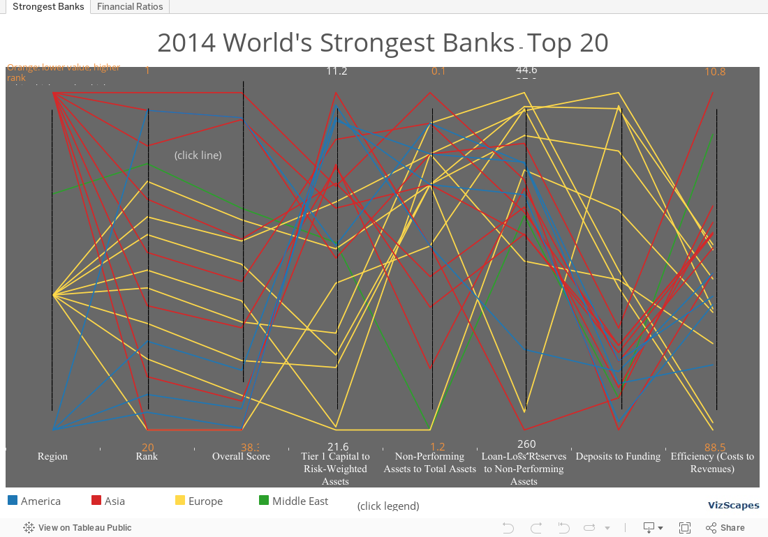
For this visualization of the world's strongest banks, 8 dimensions were used to form
parallel coordinates. For dimensions Overall
Score, Non-Performing Assets to Total Assets, and Efficiency (Costs to
Revenues), the lower the value, the higher the ranking. Whereas for dimensions Tier 1 Capital ratio,
Loan-Loss Reserves to Non-Performing Assets, and Deposits to Funding, the
higher the value, the higher the ranking.
Let’s interpret the chart (this
visualization would benefit more with a larger data population but Bloomberg Markets only released top 20
out of 97 banks ranked). Asian and
European banks account for about 40% each of the top 20 banks, and North
American banks, 20%. In general, Asian
and European banks rank higher than North American banks. The top ranking is
Hang Seng bank from Hong Kong, followed by Desjardins Group from Canada and
Norinchukin Bank from Japan, both tied at rank #2.
For Tier 1 Capital Ratio,
European banks generally have higher ratio, which means they are relatively more
well-capitalized than Asian and North American banks.
For Deposits to Funding, European
banks have lower ratio, which means they tend to lend more and are less liquid
than Asian and American banks. On
another hand, Asian and American banks have higher ratio, which means they lend
less and are more liquid. This might also
mean that Asian and American banks might not earn as much as they can compared
to European banks.
For Costs to Revenues
ratio, Asian banks have lower ratio, which means that they are run more
efficiently than European and American banks.
First initiated by Goldman Sachs as an investment concept in
2001, BRICS (Brazil, Russia, India, China, & South Africa) are gaining
economic power and aiming to create a new political and economic order. To them, the current financial system lead by
the World Bank and the International Monetary Fund is out of touch and not
suited to support the world’s emerging markets. BRICS accounts for 30% of world’s territory
and 42% of world population. Four of the BRICS — China, India, Brazil
and Russia — are now ranked among the world’s 10 largest economies.
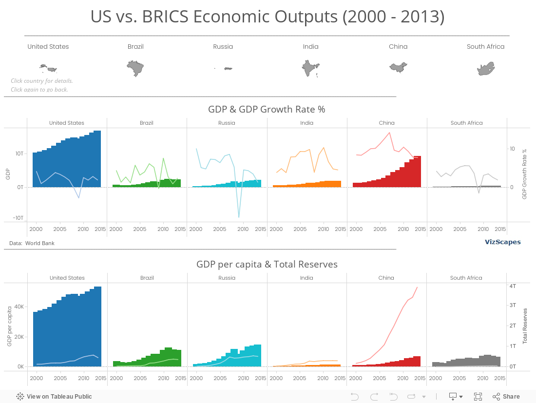
Let’s compare between the US and BRICS economic outputs. In 2000, the combined GDP of BRICS was only 26% of the US’ GDP. Thirteen years later in 2013, BRICS’ combined
GDP has climbed to 94% of the US’ GDP, with China’s GDP experiences the
sharpest increase. China’s GDP annual
growth rate is also highest among the US and other BRICS nations.
The US still commands the highest GDP per capita, whereas
China’s is still relatively low. However,
when analyzing the Total Reserves, China stands out for having the fastest
increase in total reserves from 2000-2013, and the highest total reserves in
2013 (6 times more than that of the US).
The huge total reserves not only can buffer China from drastic economic
upheavals, but also provide tremendous economic power.
With the launch of BRICS’ New Development Bank (NDB)
headquartered in Shanghai, I can’t wait to see the sibling rivalry of the World
Bank, the International Monetary Fund, and the NDB.
Since ‘87,
Forbes magazine has published the annual billionaires’ list. The list highlights the ultra-rich
individuals who exert a powerful influence on the world economy that has become
interconnected and more accessible.
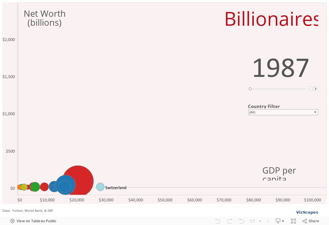
This viz shows
the global billionaires from 1987 to 2014 and includes some interesting trends:
1) Japan started out as a leader in 1987 and is now
far behind. It seems like the country
has lost its mojo in term of mega-wealth creation.
2) BRICS nations (Brazil, Russia, India, China,
& South Africa) increasingly contribute many new billionaires to the list
since 2000’s.
3) The United States, with the largest economy in
the world, has long dominated the billionaires’ list and still represents the land
of opportunities. As Forbes magazine puts it, “We needn’t love our billionaires, but we should be grateful we live in a
society that keeps creating new ones.”
** This viz was originally designed as a
motion chart, but since Tableau Public doesn’t support motion chart, the viz
was modified so that in order to see a ‘motion’ chart, you have to manually
increase the year. Sorry for the
not-so-ideal user experience.
Full of
envy? That’s OK because envy is easier
to bear than poverty.
Living in America, it’s hard to relate to the story of
refugees because life is peaceful here and we don’t have a war to run
from. The refugees are covered in the
news once in a while when Angelina Jolie decided to show up in some far-away
camps to raise awareness of the refugees’ plight.
For this dashboard, I employ the world map to highlight
where the refugees come from. The world’s
current hot spots (Afghanistan, Syria, and Somalia) stand out.
The tree map bridges between where the refugees come from
and where they resettle to.
The bar chart shows the countries that offer asylum to the refugees. The countries that are next-door neighbors to those countries where war is going on bear the brunt of offering asylum, whether they want it or not. Hovering over the bar will show each asylum country capacity and contributions to the refugees (see Lebanon).
Before: Up until last
week, the kind of bump chart I knew was the one shown in Tableau Software’s
on-demand tutorial .
It would look something like this one -- functional, basic,
but a bit boring.
After: Then I saw
this souped up bump chart at the United States Census Bureau and was intrigued. This chart not only
shows the rank but also 2 additional metrics:
(1) change in population indicated by size and (2) change in rank
indicated by color. I thought that the use
of color to indicate rank change is more meaningful than the use of color to
display different languages.
Here’s the re-creation of that bump chart using Tableau:
Hope you like it.
Building this viz about comparing giant astronomical objects
was a blast. I like working on this viz
because when your data contains stellar-theory-contradictingly large values, no
one can really tell you that (1) you are thinking small, or (2) you have a data
accuracy problem.
Notice that this viz is quite simple. The lesson from doing this viz is in the
simple and elegant design and not about using fancy functions or filters. If you think your viz has already conveyed a
story to the audience (in this case, the awesome vastness of the universe), you
should stop right there. No need
to embellish it with other features when the charts themselves tell the story
sufficiently.
In addition, I can’t help it but visualizing and looking at
bubble charts can be quite exhilarating.
Most. Fun. Ever.
Let me know what you think.
The first one is always special because it marks the genesis of a creation. This is my first post of a data viz that should begin my contribution to the Tableau users community. It's time I pay back to the community because I've learned a lot from those free tips, tricks, and beautiful vizs in Tableau Public.
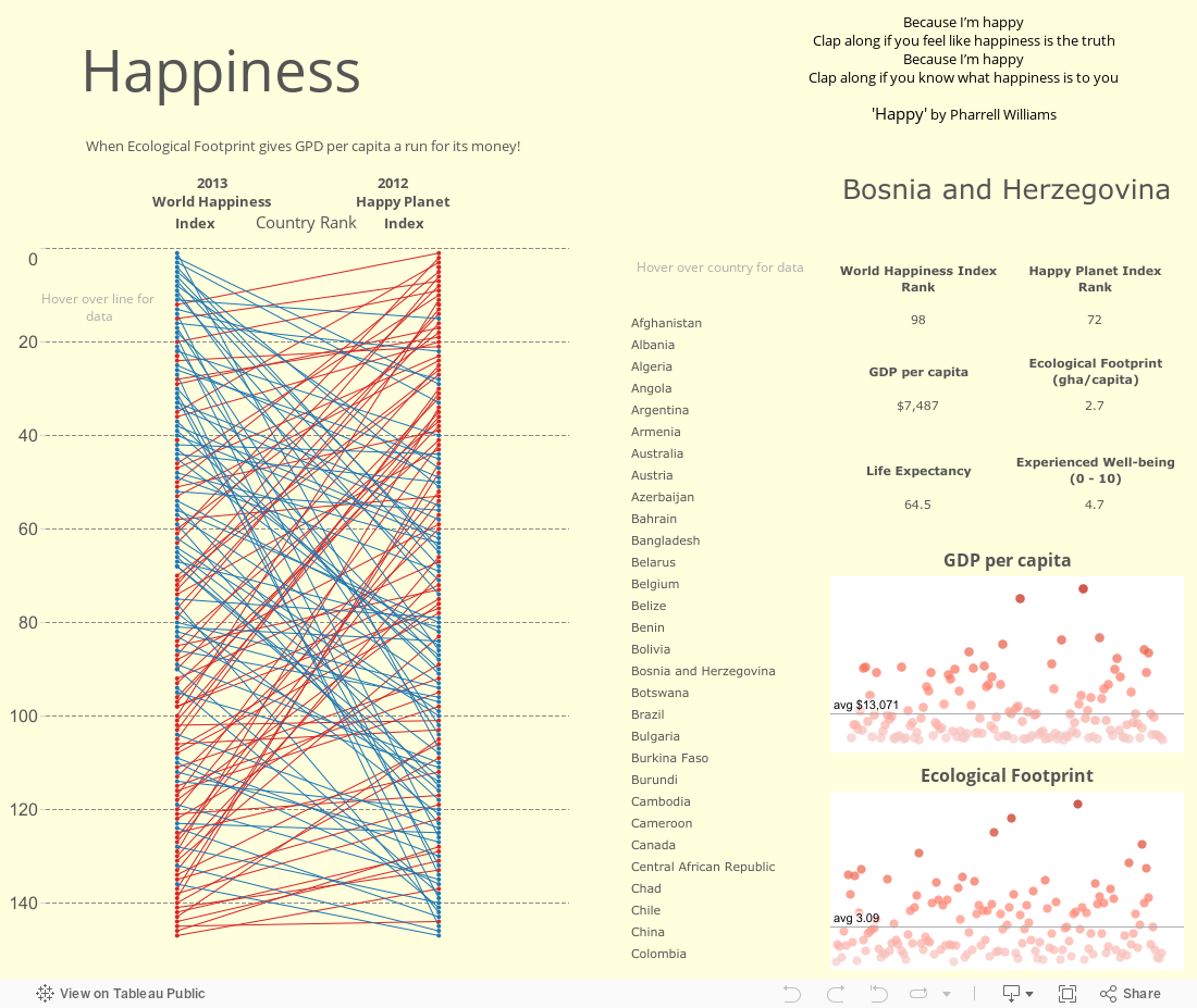
Since the first one should be auspicious, I decide to showcase this 'Happiness' dashboard that compares the 2013 World Happiness Index with the 2012 Happy Planet Index across different countries. The centerpiece of the dashboard is the slopegraph, which is quite 'aggressive' because it maps a whopping 150 data points! You can call this a slopegraph on steroid.
What do you think of my first one? I welcome any feedback.