Bump Chart
Before: Up until last
week, the kind of bump chart I knew was the one shown in Tableau Software’s
on-demand tutorial .
It would look something like this one -- functional, basic,
but a bit boring.
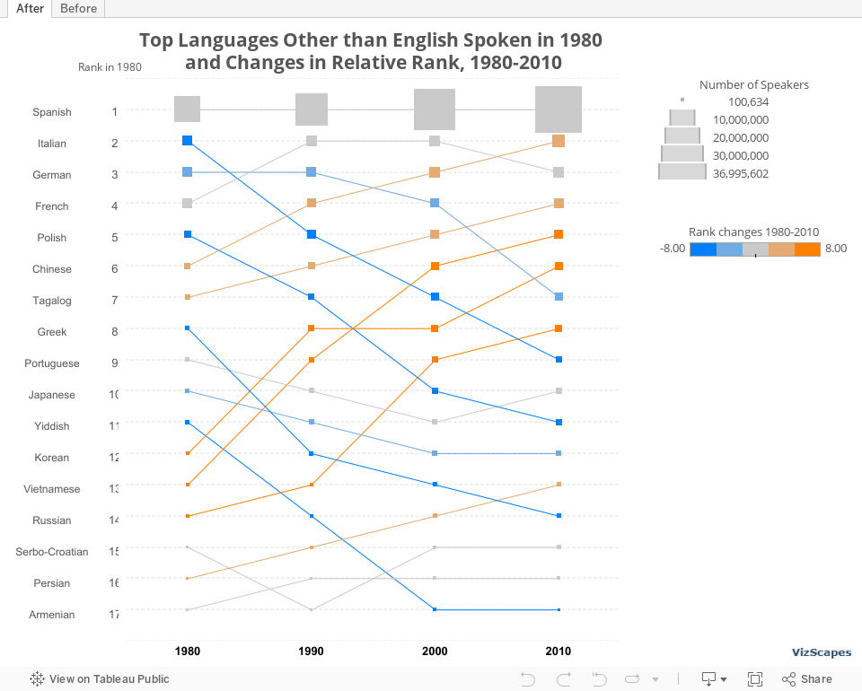
After: Then I saw
this souped up bump chart at the United States Census Bureau and was intrigued. This chart not only
shows the rank but also 2 additional metrics:
(1) change in population indicated by size and (2) change in rank
indicated by color. I thought that the use
of color to indicate rank change is more meaningful than the use of color to
display different languages.
Here’s the re-creation of that bump chart using Tableau:
Hope you like it.

No comments:
Post a Comment