The first one is always special because it marks the genesis of a creation. This is my first post of a data viz that should begin my contribution to the Tableau users community. It's time I pay back to the community because I've learned a lot from those free tips, tricks, and beautiful vizs in Tableau Public.
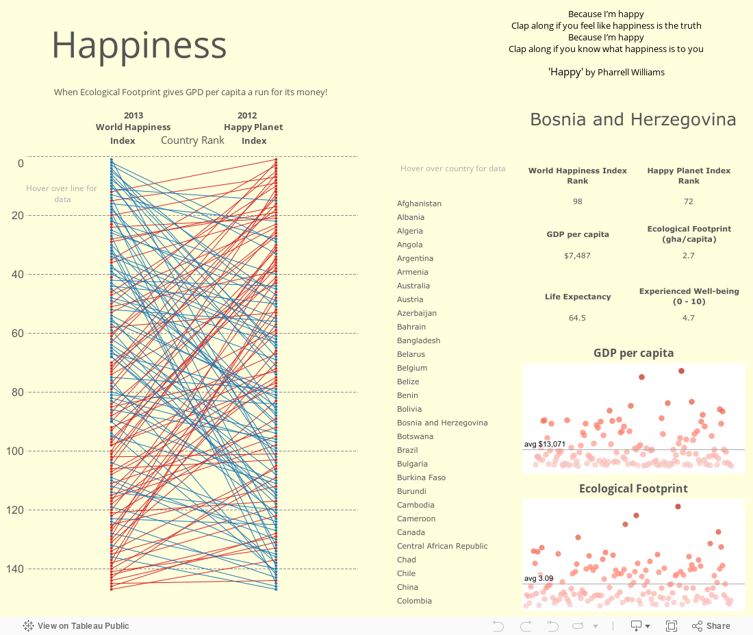
Since the first one should be auspicious, I decide to showcase this 'Happiness' dashboard that compares the 2013 World Happiness Index with the 2012 Happy Planet Index across different countries. The centerpiece of the dashboard is the slopegraph, which is quite 'aggressive' because it maps a whopping 150 data points! You can call this a slopegraph on steroid.
What do you think of my first one? I welcome any feedback.