October 27, 2023

Data Exploration with GPT-4


Environment:  ChatGPT Plus, GPT-4 with Advanced Data Analysis


Data:  Superstore dataset.


Objective:  Analyze & visualize data with GPT-4.


In my previous post, I used GPT-4 to design a dashboard with multiple graphs.  This approach is applicable when you know the data so you can instruct GPT-4 to create visualizations the way you would like to interpret the data.


But when you are not familiar with the data set, you can prompt GPT-4 to explore and visualize the data.  This method can go in many different directions, however, it can yield insights that you might not have expected.


1)   Upload and Analyze Data:  When prompted to analyze data, GPT-4 proceeds to analyze data like sales analysis, customer analysis, product analysis.


The analysis will give the results in text and numbers, which are OK.  


2)   Visualize Data:  If you want to analyze data visually, the better prompt is to ask GPT-4 to visualize data, which created graphs with key insights.  


Verdict:  When you’re not familiar with a particular data set, use GPT-4 to explore data and provide initial analysis.  Then based on these initial analyses, you can do a deep data analysis in the direction you want.  With proper guidance, GPT-4 can be your helpful assistant.


Warning:  Artificial intelligence can sometimes give convincing but fictitious answers.  Make sure you always verify the results when using any LLM’s (ChatGPT, Bard, Claude…). 


October 20, 2023

Dashboard Design in GPT-4


Environment:  ChatGPT Plus, GPT-4 with Advanced Data Analysis.


Data:  Superstore dataset.


Objective:  Design a dashboard with multiple graphs.


1)  Create Graphs:  GPT-4 was asked to create a bar chart, line chart, big number, and donut chart.


2)  Design Dashboard:  GPT-4 was prompted to arrange the graphs into a dashboard.  


3)  Format Dashboard:  The final step is to format the dashboard to give it a more refined look.  It took more than 10 prompts to give the dashboard a more professional look.  Formatting a dashboard with attention to details is a time-consuming task whether it’s done in GPT-4 or Tableau.  I guess something never changes.  


Verdict:  One plus thing is GPT-4 can arrange multiple graphs into a dashboard to provide multiple metrics to users in a single place.  One minus thing is GPT-4 can’t create filters yet for users to drill down.


October 13, 2023

Advanced Data Analysis with GPT-4


Environment:  ChatGPT Plus, GPT-4 with Advanced Data Analysis.


Data:  Alternative fueling station stations in America.


Objective:  Use GPT-4 with advanced data analysis to work with file upload, analyze and visualize data. 


1)    Upload data file:  First, the file Alternative Fuel Stations 2021.csv was downloaded from data.gov web site, cleaned up, and saved. 


To upload the data file, I selected the GPT-4 box, chose ‘Advanced Data Analysis, then clicked on the plus icon which allowed me to upload.


After reading the data from the file, GPT-4 provided an overview of the columns’ description.


2)    Describe Fuel Type Code:  I instructed GPT-4 to describe the codes in the ‘Fuel Type Code’ column and provide count of the stations.  The description clarified what each code stands for.


3)    Describe Owner Type Code:  Again, GPT-4 can mine its own data  warehouse to provide description for the owner type codes.  


4)    Map Chart:  GPT-4 was asked to visualize the station locations in the US.  It turned out GPT-4 is not good at visualizing data on a map.  The visualization was not proportional and not that useful.


5)    Bar Chart:  If GPT-4 is prompted with specific instruction, it can produce a refined bar chart of the top 10 states with most stations.


6)    Calculate Ratio:  GPT-4 can mine its data warehouse and incorporate its data with the uploaded data.  Below, GPT-4 combined state population with number of stations to calculate the ratio of population vs number of stations for each state.  


Here, GPT-4 provides such a huge benefit and can save lots of time for the users.  If this were done in Tableau, users would have to search for a population data set, downloaded and added it to Tableau workbook.  The 2 data sets would have to be blended before the ratio can be calculated.  


7)    Export to PDF:  After generating a chart, GPT-4 can export chart to PDF file for downloading.


Verdict:  I’m impressed with how readily GPT-4 can interpret and understand the data.  The way it incorporates data from its data warehouse with the uploaded data set and seamlessly calculates the ratio is remarkable.  Note that users always need to verify the calculations as GPT-4 can hallucinate and provide incorrect results.  However, GPT-4 didn't seem to hallucinate in this run.


September 22, 2023

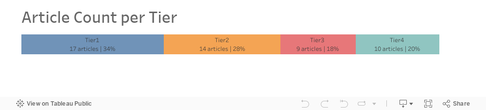
Article Count per Tier

Data: The data set has 50 articles with the number of views per each article.  


Requirement:  Create a bar chart with 4 tiers that shows how many articles per tier based on number of views.  Also, assign a score to each tier.


This post will explain how to use the RANK_PERCENTILE function in Tableau Prep to create different tiers and assign a score for each record based on what tier the record belongs to.  The RANK_PERCENTILE function returns the percentile rank for the current row in the partition.


Here’re the steps:


1) Use aggregation to count # of articles per each view.


2) Create a Rank Percentile formula based on Views.


@Rank Percentile

{ORDERBY [Views] ASC: RANK_PERCENTILE() }


3) Create a ‘Tier Label’ formula based on 4 tiers. 

Tier1: 0% - 25%, Tier2: >25% - 50%, Tier3: >50% - 75%, and Tier4: >75% - 100%.


@Tier Label

if [Rank Percentile] <= 0.25 then 'Tier1'

elseif [Rank Percentile] > 0.25 and [Rank Percentile] <= 0.5 then 'Tier2'

elseif [Rank Percentile] > 0.5 and [Rank Percentile] <= 0.75 then 'Tier3'

else 'Tier4'

end


4) Join back to the original data set based on Views so that each article will have Tier Label.


5) Create a 'View Score' formula to assign a score based on tier label.


@View Score

CASE [Tier Label]

When 'Tier1' then 1

When 'Tier2' then 2

When 'Tier3' then 3

When 'Tier4' then 4

END


August 11, 2023

Multi-Rows Calculation in Tableau Prep 2023.2

 
Tableau Prep 2023.2 has released a multi-rows calculation feature that allows for these 3 calculations:

1)    Difference From:  Calculates the difference between the current row value and the flexible option of previous value or next value.  There’s an option to change the position of the previous value or next value.


2)    Percent Difference From:  Calculates the difference between the current row value and the flexible option of previous value or next value as a percentage.  There’s an option to change the position of the previous value or next value.


3)   Moving Calculation:  Calculates the moving sum or average of a numeric field with flexible option of previous value or next value.


The user-friendly calculation editor has made it easy for users to visually understand how the multi-rows calculation is computed.  For example, the ‘Group by’ section allows users to include either one or multiple dimensions for partition.  The ‘Sort by’ section allows users to include either one or multiple dimensions for sorting.  The 'Results' section lets users select computation by Sum or Average.  Try out this new feature in Tableau Prep 2023.2 in your next data transformation.


July 21, 2023

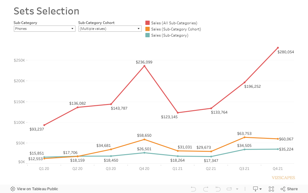
Sets Selection


Sets are custom fields that define a subset of data and they can be used to compare subsets of data. 

This visualization is comparing sales for (a) one sub-category, (b) sub-category cohort, and (c) all sub-categories.  The steps to create the calculations are:


1) Create a set for sub-category, a set for sub-category cohort, and a set for all sub-categories.


2) Create formulas to calculate for sales based on each set.


@Sales (Sub-Category)

if [Sub-Category Set] then [Sales] end


@Sales (Sub-Category Cohort)

if [Sub-Category Cohort Set] then [Sales] end


@Sales (All Sub-Categories)

if [All Sub-Category Set] then [Sales] end


3) Use these formulas to create a line chart for data comparison among the sets. 


4) Show sets for users to select a member for Sub-Category Set or members for Sub-Category Cohort Set.