February 13, 2015
January 23, 2015
Discrimination in Online Ad Delivery
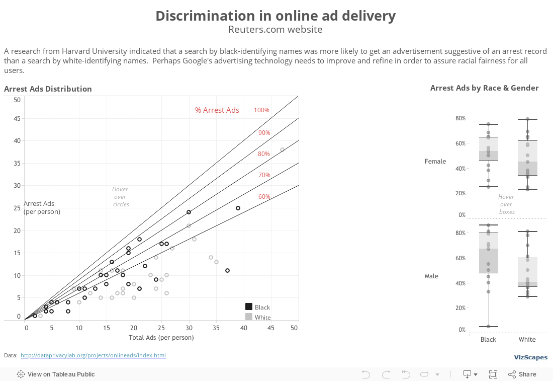
Have you been arrested? Imagine this question appears when someone searches for your name on the Internet. The Discrimination in Online Ad Delivery report by Professor Latanya Sweeney from Harvard University indicated that an Internet search by black-identifying names was more likely to yield an advertisement suggestive of an arrest record than a search by white-identifying names (download report here). This racially biased advertisement distribution could inadvertently impact a person’s reputation and the affected person might not know about the potential negative consequences.
However, advertisers are protected under the First Amendment of the Constitution that advertisements are commercial free speech. But what if the advertisements suggestive of a criminal background appear more frequently for one racial group than for another’s, is that still free speech or has it become racial discrimination? As this research yielded more questions than answers, perhaps Internet search companies should yield to moral high grounds and refine their search logic to provide a user experience free of racial bias.
This viz was influenced by the New York Times’ “Why Is Her Paycheck Smaller” graph, which has been well-received in the data visualization community for its elegant use of annotation to deliver the thought-provoking message. In order to draw the diagonal lines in the scatter plot, I sought help from Tableau Zen Master extraordinaire, Joe Mako. Then I inserted the ‘% Arrest Ads’ annotations to the viz. The final result highlights the unfair issue of discrimination in online ad delivery.
In addition, the box plots to the right show the differential on the arrest ads display when searching for names according to race and gender.
This viz was made possible with the permission of Professor Latanya Sweeney from Harvard University and the contribution of Joe Mako, Tableau Zen Master. I'm grateful to both for their generosity.
January 2, 2015
Global Warming
Let’s start the New Year with a hot topic and a Nobel-Prize-quality global thematic
report. The ‘Climate Change 2013 Assessment Report’, produced by the Intergovernmental Panel on Climate Change (IPCC) based in Geneva, provides a comprehensive view of
the current scientific knowledge of climate change. It’s a compelling read into global warming and
its potential environmental and socio-economic impacts.
What fascinating about this authoritative 1522-pages report is that it contains 482 sophisticated graphs that help to illustrate complex concepts into something more understandable. The graphs play an important role in consolidating numerous points into singular visualizations that define a central concept. If a picture is worth a thousand words, then these 482 graphs tell many mini-stories and together enhance the value of the report tremendously.
I’m happy to recommend this extraordinary report because (1) global warming is currently relevant, and (2) this report is a fine example of how the combination of excellent research writing and meaningful data visualization/illustration can yield outstanding result. This report is epic. Obviously, there’ll be no viz of mine because none is needed. By the way, Al Gore and IPCC shared the 2007 Nobel Peace Prize together.
December 5, 2014
November 7, 2014
State of the Future
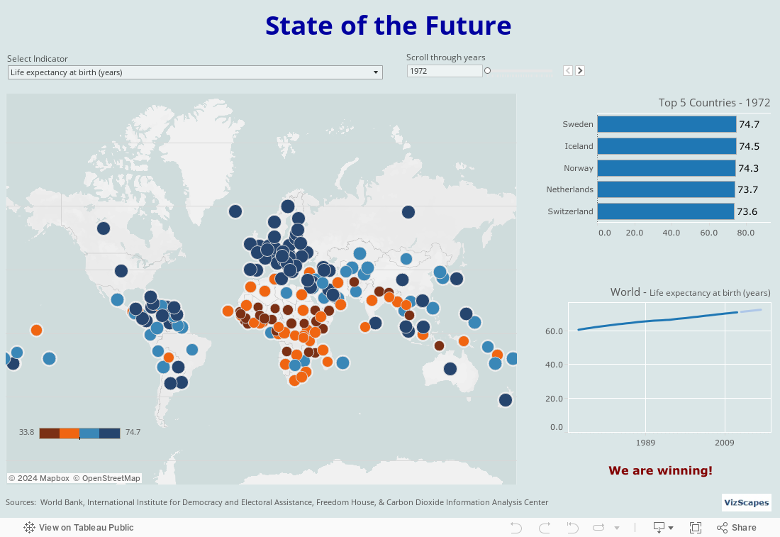
The 2013-14 State of the Future is a compelling global thematic report produced by the Millennium Project based in Washington, D.C. Researchers from around the world collaborate to collect and provide a diversity of opinions, then distill and integrate those data to forecast the future. It’s a thought-provoking read into the advancements and challenges of the humanity and what the future might hold for our 7.1 billion people living together in this interconnected world.
For such a special report, the graphs are quite rudimentary
(download the 2013-14 State of the Future report here). There’s such a wealth of
information in this 243-page report that can yield many different
visualizations. I think this report can
benefit tremendously from a team of data visualization experts who can produce
beautiful and meaningful graphs befitting this fascinating report. For my part, I’ve visualized the different
indicators that together compose the State of the Future Index (page 5).
The data for this viz has both breadth (25 indicators) and
depth (215 countries and from 1972-2013), however, the data is not uniform
because it is not available for all the years and for all countries. So
there’s a small hiccup in the viz when changing from some indicators to
another.
For example, data for indicator ‘Life expectancy at birth
(years)’ ranges from 1972-2012. But for
indicator ‘Internet users (per 100 people)’, data is available only from
1990-2012. So when the indicator is
changed from ‘Life expectancy’ to ‘Internet users’, the world map might
disappear.
The solution is to scroll to the next available year and the world map will reappear.
Since this report is for futurists, I’ve used the Forecast function in the ‘World’ graph to predict the next 6-years trend for the indicators using 95% prediction intervals. In addition, the ‘World’ graph shows how the world population is doing for each indicator. There're more winnings than losings so we are making progress over the years, albeit at the expense of the environment!
As an optimist, I believe the future is bright and promising ahead.
October 10, 2014
Nigeria
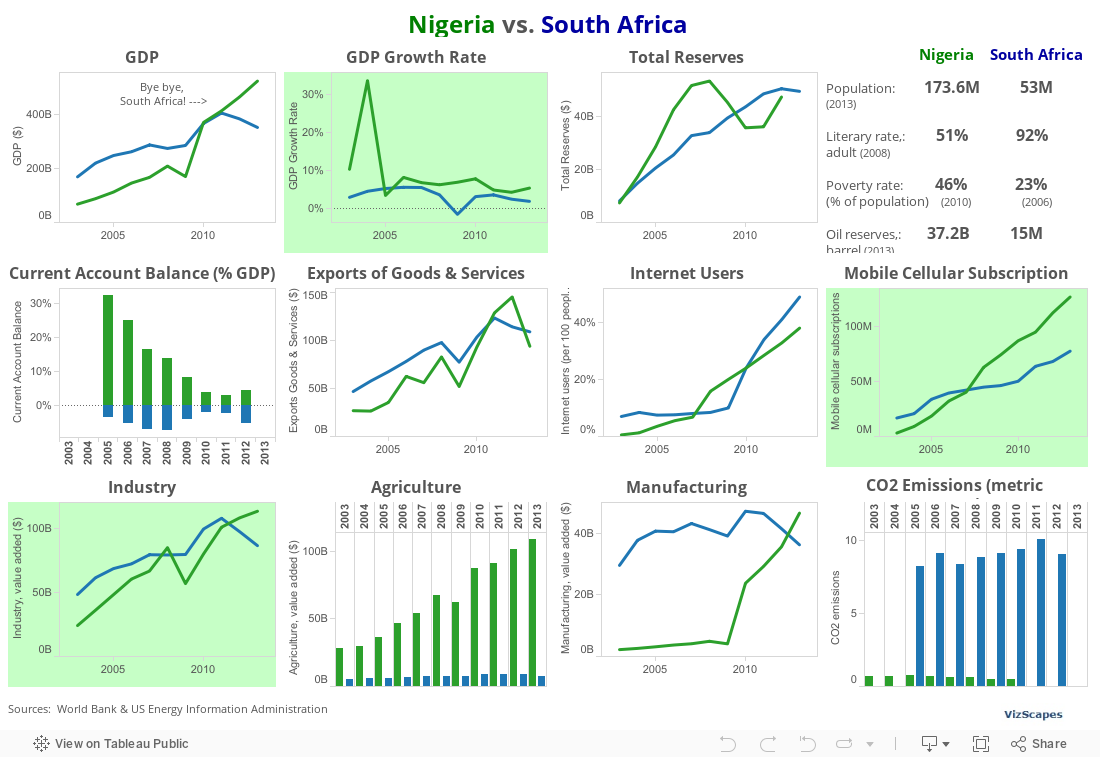
In April 2014, Nigeria surpassed South Africa as having the biggest economy in Africa. Nigeria’s Gross Domestic Product (GDP) was adjusted to $510 billion in 2013, 89% larger than previously estimated. This was because the economists adjusted how the country’s GDP was calculated, something they hadn’t done since 1990.
GDP adjustment is the process of replacing an old base year
with a more recent one which reflects the dynamic price structure and captures
economic growth. The IMF standard for GDP adjustment is every 5 years. But in Nigeria’s case, it took 24 years.
What had changed in the last 24 years was Nigeria’s fast economic expansion, changing from a financial base of crude oil to more diversified
activity including such vibrant sectors as manufacturing, agriculture,
financial services, mobile telephony and Nollywood. For example, the number of mobile phone
subscribers has leapt from a few hundred thousand customers to some 120M
today. The telecoms sector has jumped
from less than 1% to almost 9% of GDP.
Nollywood, which did not appear in 1990, is said to contribute 1.4% to
the GDP. More small and medium scale
enterprises (SMEs) have also been flourished. 1
Now that Nigeria’s GDP is larger than United Arab Emirates’
and South Africa becomes Africa’s Number Two, Nigeria is expected to continue
its 7% average annual growth, while South Africa’s economy would chug along
with 2% growth for next couple of years.
The reality is that Nigeria still has many problems to
overcome such as corruption, underdeveloped infrastructure, & large
poverty. However, Nigeria is a young
market and the opportunity is huge. "If
you're not in Nigeria, you're not in Africa," said Nigerian Finance Minister Ngozi Okonjo-Iweala.
_________________________
Note:
1 Mordi, Frederick, “Nigeria
overtakes rival South Africa”, African
Business, June 2014, pp. 74-75
This viz was made up of basic bar and line charts, with a touch of color to make it pop.
September 19, 2014
Technology, Media & Telecoms
I was happy to come across “The Future of Technology, Media & Telecoms” report from CM Research in London. This trend forecast report provides in-depth global thematic research in the Technology, Media and Telecoms sectors convergence. It’s a fascinating read into the competitive battle among high-tech companies for global supremacy.
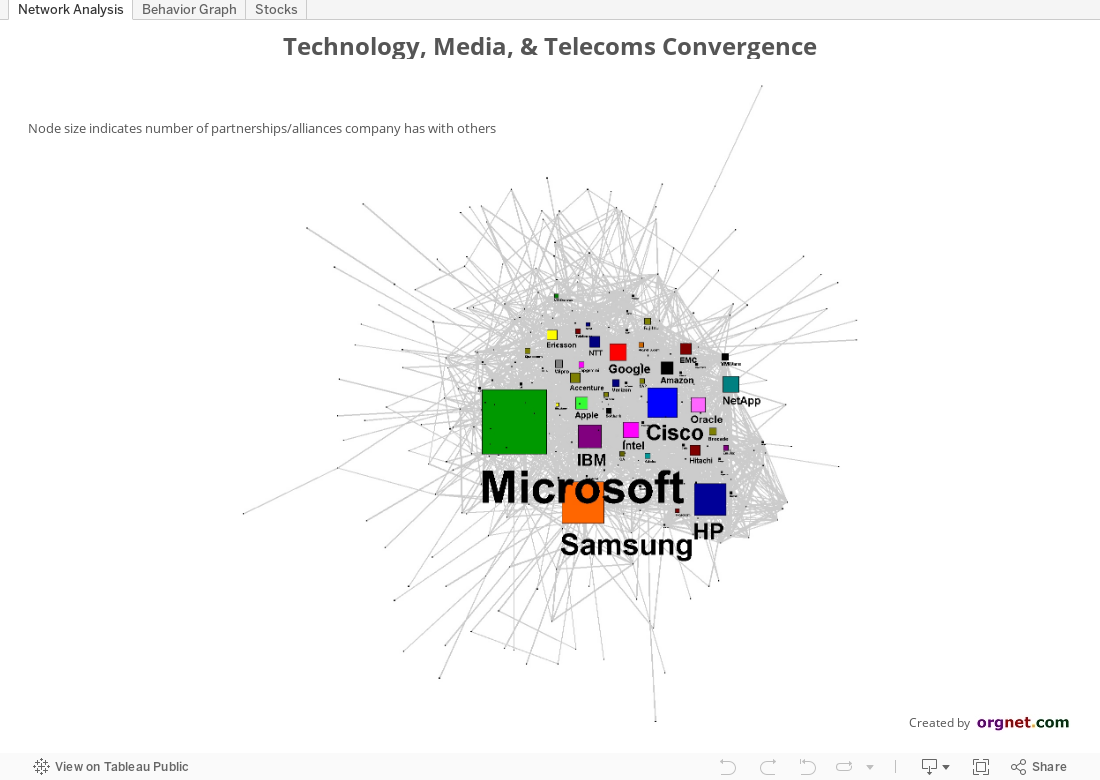
I thought this report can benefit from network analysis and proceeded to do so, using the ‘Build Network Graphs in Tableau’ guest post by Michael Martin as reference. I didn’t make good progress so I consulted with Valdis Krebs, the leading expert in social network analysis at Orgnet, LLC, who informed me that Tableau is good for standard statistics (independent variables), but not designed for relational statistics (interdependent variables) on a large scale. Instead, he graciously designed the Network Analysis graph and the Behavior graph using Orgnet’s proprietary application.
The Network Analysis graph shows relationship among companies, with the node size indicates number of partnerships/alliances a company has formed with others. The top 2 companies that have the most number of alliances are Microsoft and Samsung. Surprisingly, Apple, the company with the biggest market value of $600 billion, doesn’t have as many alliances as its rival Samsung, maybe because Apple prefers to form a tight circle of trusted partnerships. Large successful Internet companies such as Google and Amazon also don’t have as many alliances, perhaps because they’re still relatively young or because they’re pioneers in their own paths.
For an even deeper analysis, we look into a behavior graph. Accordingly to Valdis Krebs, “Two companies are connected if they have chosen a similar set of partners. Now, since partners usually bring new knowledge, technology and ability to a situation, we don’t want to be linked to our competitors in this map -- we lose advantage because we are accessing the same resources and knowledge. In fact in this behavior graph, we want to have as few links as possible -- we do not want to be following a similar strategy that many others are. So, the companies that have a lot of connections to each other, especially if they are competitors, are all constraining each other's ability to innovate and compete -- you can not be different and better if all of you are competing on the same knowledge and abilities. Notice key industry players like Apple, Google, Microsoft, Facebook, AT&T, and Amazon do not have many companies with similar partner patterns. They each are planning a unique ecosystem to compete from.”
In the ‘Stocks’ tab is the bar chart for the cumulative 5 ½ years stock price performance from January 2009 to June 2014. This chart is similar to the one in the “The Future of Technology, Media & Telecoms” report, but now it has a filter for different categories (look at Netflix in Infrastructure Software & Cloud category!).
This visualization was created with the permission of Cyrus Mewawalla, Director of CM Research, and with the contribution of Valdis Krebs, Founder of Orgnet, LLC.. I’m grateful to both for their generosity.
Subscribe to:
Posts (Atom)