Living in America, it’s hard to relate to the story of
refugees because life is peaceful here and we don’t have a war to run
from. The refugees are covered in the
news once in a while when Angelina Jolie decided to show up in some far-away
camps to raise awareness of the refugees’ plight.
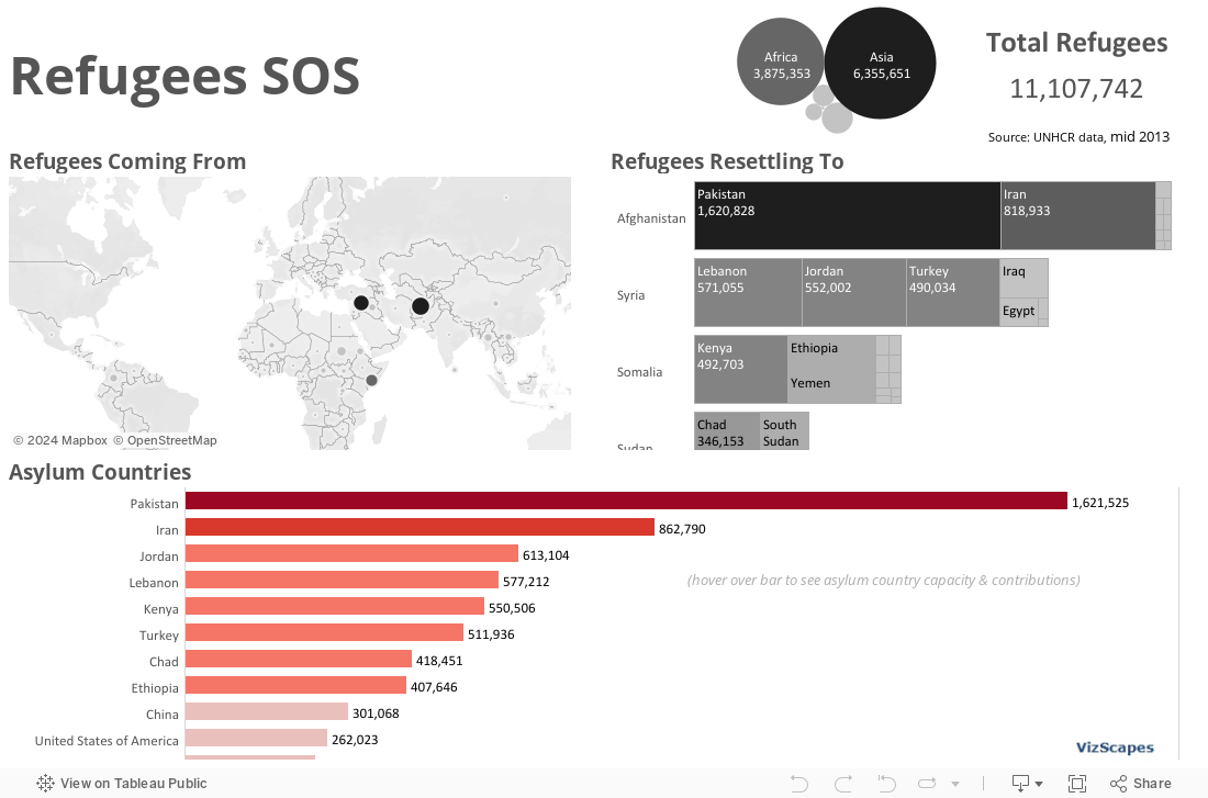
For this dashboard, I employ the world map to highlight
where the refugees come from. The world’s
current hot spots (Afghanistan, Syria, and Somalia) stand out.
The tree map bridges between where the refugees come from
and where they resettle to.
The bar chart shows the countries that offer asylum to the refugees. The countries that are next-door neighbors to those countries where war is going on bear the brunt of offering asylum, whether they want it or not. Hovering over the bar will show each asylum country capacity and contributions to the refugees (see Lebanon).
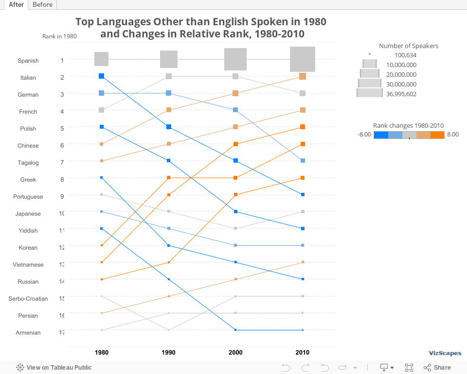
Before: Up until last
week, the kind of bump chart I knew was the one shown in Tableau Software’s
on-demand tutorial .
It would look something like this one -- functional, basic,
but a bit boring.
After: Then I saw
this souped up bump chart at the United States Census Bureau and was intrigued. This chart not only
shows the rank but also 2 additional metrics:
(1) change in population indicated by size and (2) change in rank
indicated by color. I thought that the use
of color to indicate rank change is more meaningful than the use of color to
display different languages.
Here’s the re-creation of that bump chart using Tableau:
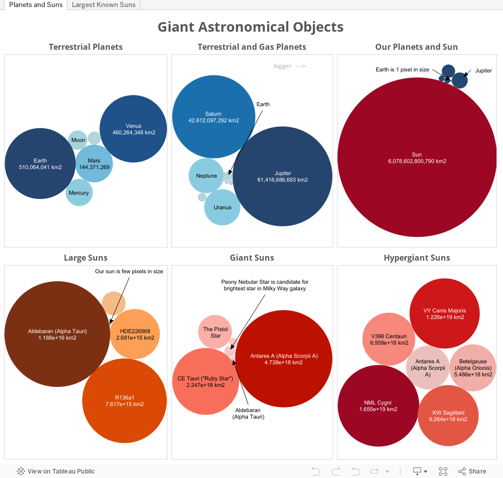
Building this viz about comparing giant astronomical objects
was a blast. I like working on this viz
because when your data contains stellar-theory-contradictingly large values, no
one can really tell you that (1) you are thinking small, or (2) you have a data
accuracy problem.
Notice that this viz is quite simple. The lesson from doing this viz is in the
simple and elegant design and not about using fancy functions or filters. If you think your viz has already conveyed a
story to the audience (in this case, the awesome vastness of the universe), you
should stop right there. No need
to embellish it with other features when the charts themselves tell the story
sufficiently.
In addition, I can’t help it but visualizing and looking at
bubble charts can be quite exhilarating.
Most. Fun. Ever.